Page 340 - ES 2020-21_Volume-1-2 [28-01-21]
P. 340
The Bare Necessities  323


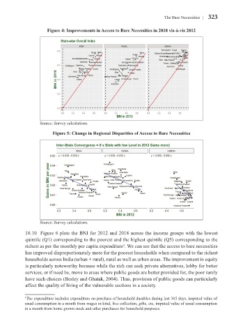
                       Figure 4: Improvements in Access to Bare Necessities in 2018 vis-à-vis 2012


                    Source: Survey calculations.


                          Figure 5: Change in Regional Disparities of Access to Bare Necessities


                    Source: Survey calculations.

             10.10  Figure 6 plots the BNI for 2012 and 2018 across the income groups with the lowest
             quintile (Q1) corresponding to the poorest and the highest quintile (Q5) corresponding to the
             richest as per the monthly per capita expenditure . We can see that the access to bare necessities
                                                           3
             has improved disproportionately more for the poorest households when compared to the richest
             households across India (urban + rural), rural as well as urban areas. The improvement in equity
             is particularly noteworthy because while the rich can seek private alternatives, lobby for better
             services, or if need be, move to areas where public goods are better provided for, the poor rarely
             have such choices (Besley and Ghatak, 2004). Thus, provision of public goods can particularly
             affect the quality of living of the vulnerable sections in a society.


             3 The expenditure includes expenditure on purchase of household durables during last 365 days, imputed value of
             usual consumption in a month from wages in kind, free collection, gifts, etc, imputed value of usual consumption
             in a month from home grown stock and other purchases for household purposes.

